


About Course
This course is designed to teach you how to create responsive, mobile-first web designs using the Bootstrap framework. Learn to leverage Bootstrap’s powerful grid system, components, and utilities to design professional, visually appealing websites quickly and efficiently.
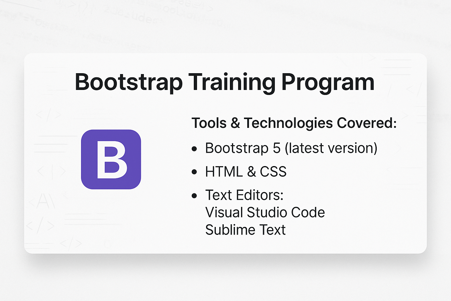
Tools & Technologies Covered:
- Bootstrap 5 (latest version)
- HTML & CSS
- Text Editors: Visual Studio Code, Sublime Text
Course Overview
This course will help you:
- Understand the fundamentals of the Bootstrap framework.
- Build fully responsive and mobile-friendly web layouts.
- Use pre-designed components and utilities to create professional websites.
Course Curriculum
Module 1: Introduction to Bootstrap
- What is Bootstrap?
- Setting Up a Bootstrap Project
- CDN Integration vs. Local Installation
- Overview of the Bootstrap Ecosystem
Module 2: Bootstrap Grid System
- Understanding the Grid System
- Rows and Columns
- Breakpoints for Responsive Design
- Creating Responsive Layouts
- Fluid Containers
- Nesting Columns
- Using Flexbox in Bootstrap
Module 3: Bootstrap Components
- Working with Common Components
- Navbar and Navigation Menus
- Modals and Popups
- Buttons and Button Groups
- Cards and Media Objects
- Forms in Bootstrap
- Input Fields, Dropdowns, Checkboxes, and Radio Buttons
- Form Validation and Layouts
Module 4: Bootstrap Utilities
- Spacing and Sizing
- Margins and Padding
- Width and Height Utilities
- Typography
- Text Alignment, Colors, and Styling
- Colors and Backgrounds
- Using Predefined Colors
- Adding Background Images and Gradients
Module 5: Advanced Customization
- Overriding Default Styles with Custom CSS
- Using Sass for Advanced Styling
- Customizing Bootstrap Variables
Module 6: Building Responsive Websites
- Creating Navigation Menus with Dropdowns
- Building Hero Sections with Jumbotrons
- Designing Feature Sections with Grids and Cards
- Adding Interactive Elements with JavaScript Components
Module 7: Real-World Project
- Designing a Responsive Multi-Page Website
- Implementing Components and Utilities in a Practical Scenario
- Optimizing Website Performance for Mobile and Desktop
Key Features:
- Hands-On Practice: Build responsive websites with Bootstrap’s components and utilities.
- Comprehensive Curriculum: Covers foundational to advanced Bootstrap features.
- Certification: Earn a Bootstrap Development certificate upon successful completion.
Who Should Attend?
- Aspiring front-end developers looking to learn responsive design.
- Web designers wanting to streamline their workflow.
- Anyone aiming to create professional and visually appealing websites.